
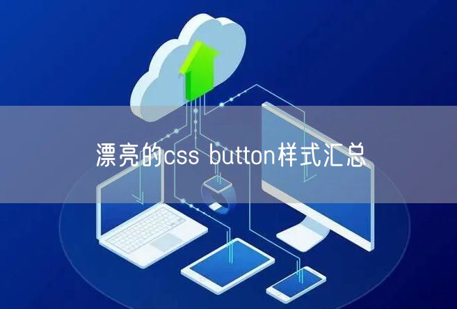
button属性,button设置自定义属性。之前简单学习了 HarmonyOS Text 文本的基本属性,今天来学习一下 Button 按钮的基本应用;
Button
Button 在日常开发中是必不可少的,在 Android 平台中,Button 是继承自 TextView,而在 HarmonyOS 平台中,Button 同样继承自 Text;两种语言的设计原理基本相同;
// Android
@RemoteView
public class Button extends TextView {
    public Button(Context context) {
        this(context, null);
    }

    public Button(Context context, AttributeSet attrs) {
        this(context, attrs, com.android.internal.R.attr.buttonStyle);
    }

    public Button(Context context, AttributeSet attrs, int defStyleAttr) {
        this(context, attrs, defStyleAttr, 0);
    }

    public Button(Context context, AttributeSet attrs, int defStyleAttr, int defStyleRes) {
        super(context, attrs, defStyleAttr, defStyleRes);
    }

    @Override
    public CharSequence getAccessibilityClassName() {
        return Button.class.getName();
    }

    @Override
    public PointerIcon onResolvePointerIcon(MotionEvent event, int pointerIndex) {
        if (getPointerIcon() == null && isClickable() && isEnabled()) {
            return PointerIcon.getSystemIcon(getContext(), PointerIcon.TYPE_HAND);
        }
        return super.onResolvePointerIcon(event, pointerIndex);
    }
}

// HarmonyOS
public class Button extends Text {
    public Button(Context context) {
        super((Context)null);
        throw new RuntimeException("Stub!");
    }

    public Button(Context context, AttrSet attrSet) {
        super((Context)null);
        throw new RuntimeException("Stub!");
    }

    public Button(Context context, AttrSet attrSet, String styleName) {
        super((Context)null);
        throw new RuntimeException("Stub!");
    }
}
Button 通过点击触发,常见的有文本按钮,图标按钮,以及文本图标按钮,样式也是包括圆角,触发变色等多种常见效果;逐一进行尝试;
1. 文本按钮
文本按钮仅需设置 text 属性即可;
<Button
    ohos:height="match_content"
    ohos:width="match_parent"
    ohos:background_element="$graphic:background_ability_text"
    ohos:left_margin="10vp"
    ohos:padding="10vp"
    ohos:right_margin="10vp"
    ohos:text="Button01"
    ohos:text_size="16fp"/>

2. 图标按钮
图标按钮可以通过设置 element 属性实现,此时无需设置 text 属性;
<Button
    ohos:height="match_content"
    ohos:width="match_content"
    ohos:background_element="$graphic:background_ability_text"
    ohos:element_start="$media:icon"
    ohos:layout_alignment="center"
    ohos:left_margin="10vp"
    ohos:padding="10vp"
    ohos:right_margin="10vp"
    ohos:text_size="16fp"
    ohos:top_margin="10vp"/>

3. 文本图标按钮
文本图标属性是 text 与 element 属性的结合,其中若需要设置文本与图标元素的间距可以通过 element_padding 属性实现;
<Button
    ohos:height="match_content"
    ohos:width="match_content"
    ohos:background_element="$graphic:background_ability_text"
    ohos:element_left="$media:icon"
    ohos:element_padding="10vp"
    ohos:layout_alignment="center"
    ohos:left_margin="10vp"
    ohos:padding="10vp"
    ohos:right_margin="10vp"
    ohos:text="Button02"
    ohos:text_size="16fp"
    ohos:top_margin="10vp"/>

4. 圆角按钮
对于按钮的形状,背景色等一般都是通过 shape 文件进行调整;shape 中有多种属性与 Android 平台类似;
solid 为背景填充色
corner 为四个角的的圆角半径
bounds 为里面的文字与边界的间隔,但是单独设置不生效
stroke 为边框属性
gradient 为渐变效果,但是单独设置不生效
<?xml version="1.0" encoding="UTF-8" ?>
<shape xmlns:ohos="http://schemas.huawei.com/res/ohos"
       ohos:shape="rectangle">
    <solid
        ohos:color="#FFCCAA"/>
    <corners
        ohos:radius="12vp"/>
</shape>

<Button
    ohos:height="match_content"
    ohos:width="match_content"
    ohos:background_element="$graphic:shape_corner"
    ohos:element_left="$media:icon"
    ohos:element_padding="15vp"
    ohos:layout_alignment="center"
    ohos:left_padding="30vp"
    ohos:padding="10vp"
    ohos:right_padding="30vp"
    ohos:text="Button03"
    ohos:text_size="16fp"
    ohos:top_margin="10vp"/>

5. 边框按钮
可以通过 shape 中的 bounds 设置按钮的边框效果;
<?xml version="1.0" encoding="UTF-8" ?>
<shape
    xmlns:ohos="http://schemas.huawei.com/res/ohos"
    ohos:shape="rectangle">
    <solid
        ohos:color="#FFCCAA"/>
    <corners
        ohos:radius="12vp"/>
    <stroke
        ohos:color="#CCAA00"
        ohos:width="4vp"/>
</shape>

6. 渐变色按钮
尝试 gradient 渐变色属性,但是无法直接实现,于是查询了一些资料,通过 xml 和 Java 代码两种方式实现;
6.1 xml 方式
HarmonyOS 中 gradient 暂时只提供了一个 shader_type 样式属性,但是 solid 可以添加多种颜色,可以将渐变色填充在 solid 中,在 gradient 中设置渐变效果(线性渐变、角度渐变等);
<?xml version="1.0" encoding="UTF-8" ?>
<shape
    xmlns:ohos="http://schemas.huawei.com/res/ohos"
    ohos:shape="rectangle">

    <solid ohos:colors="#FFCCAA,#FFFFFF,#CCAA00"/>

    <corners
        ohos:radius="12vp"/>

    <gradient
        ohos:shader_type="linear_gradient"/>
</shape>
6.2 Java 方式
尝试了 Java 方式,通过 ShapeElement 对背景效果进行设置,会在后续文章中详细学习 ShapeElement;
Button button1 =(Button) findComponentById(ResourceTable.Id_test_btn1);
button1.setBackground(linearGradientShape());

private ShapeElement linearGradientShape(){
    ShapeElement shapeElement = new ShapeElement();
    shapeElement.setShape(ShapeElement.RECTANGLE);
    shapeElement.setCornerRadius(30.0f);
    RgbColor[] rgbColors = new RgbColor[]{
            RgbColor.fromArgbInt(getColor(ResourceTable.Color_color_btn_start)),
            RgbColor.fromArgbInt(getColor(ResourceTable.Color_color_btn_center)),
            RgbColor.fromArgbInt(getColor(ResourceTable.Color_color_btn_end))};
    shapeElement.setRgbColors(rgbColors);
    shapeElement.setShaderType(ShapeElement.LINEAR_GRADIENT_SHADER_TYPE);
    shapeElement.setGradientOrientation(ShapeElement.Orientation.LEFT_TO_RIGHT);
    return shapeElement;
}

7. 点击变色按钮
对于触发点击变色按钮,与 Android 方式类似,通过设置两个 shape 背景效果,在 state-container 中添加默认和点击效果即可;
<?xml version="1.0" encoding="utf-8"?>
<state-container
    xmlns:ohos="http://schemas.huawei.com/res/ohos"
    ohos:shape="oval">

    <item
        ohos:element="$graphic:shape_corner_selected"
        ohos:state="component_state_pressed"/>

    <item
        ohos:element="$graphic:shape_corner_normal"
        ohos:state="component_state_empty"/>
</state-container>

尝试了对 Button 样式的多种效果,与 Android 开发方式大同小异,很多具体的 API 还需要参考查询文档;若有问题,请多多指导!
本文地址:软件教程频道 https://www.eeeoo.cn/ruanjian/903139.html,嗨游网一个专业手游免费下载攻略知识分享平台,本站部分内容来自网络分享,不对内容负责,如有涉及到您的权益,请联系我们删除,谢谢!
 相关阅读
相关阅读